This is my double page spread research and development. Here, I will further analyze double page spread on magazines.
𝑺𝒆𝒍𝒇 𝑹𝒆𝒇𝒍𝒆𝒄𝒕𝒊𝒐𝒏 (more self reflection after each magazine analysis):
Identifying the features itself is quite easy for me however out of the whole magazine there were mostly double pages with only a huge picture covering up all the space, I thought that this was a generic conventions of the magazine's genre (fashion). Although, a problem of this would be (again) my time management. I didn't completed it on time according to the timeline given but I managed to finish it before the submission of the whole blog was due for my Media Teacher (Mr Nick) to grade it. I thoroughly enjoyed giving my opinions towards the double page and identifying its effect towards the readers impression (from my view) and consider to implement the features in my own magazine.
1. Cosmopolitan - September/October 2023 issue - Hearst

Before Reading |
Magazine: | Cosmopolitan |
Issue: | Date of Issue: September/October 2023 Issue No.: Vol. 272 No. 5 |
Publisher: | Hearst |
Genre: | Hybrid: Women’s fashion and entertainment (Doesn’t fit to a sub-genre) |
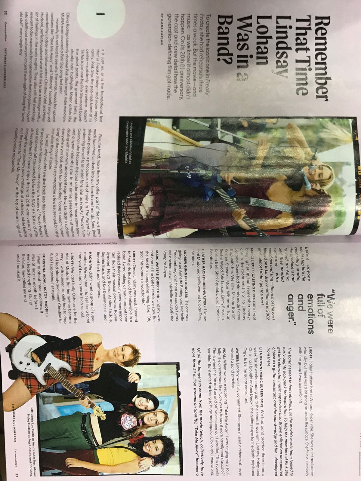
Images: | Total: 3 Pictures: Shots from scenes in the movie ‘Freaky Friday’, specifically a girl band shown with Lindsay Lohan as star appeal. |
Layout | Negative spaces are used effectively to not overwhelm readers from excessive texts, although it may be unbalanced and unproportionate from the whole page (text tends to be near the end of the page(s) and gives a large amount of unnecessary negative space in the middle of the page). A drop cap is shown along with the page number on its supposed place, but the drop cap seems to be oddly positioned and shaped. |
First impressions: | The length of the text is thoughtfully written, it doesn’t overwhelm how full the page is which I was quite fond of. But what I dislike is the drop cap, it is round and I barely can tell that it’s a letter (I), it is also located at the very edge of the page which is just bizarre. |
After Reading |
Heading: | “Remember That Time Lindsay Lohan Was in a Band?” |
Subheading: | To create the iconic one in Freaky Friday, she had rehearsals three times a week, But the movie--and music--as we know it almost didn't happen. On its 20th (!) anniversary, the cast and crew detail how the generation-defining film got made. |
Author: | Article writer/author: Ilana Kaplan |
Article: | The article mentions the appeal of famous actress, Lindsay Lohan, in an early 2000s teen movie ‘Freaky Friday’. The article tells the journey on production stage, specifically during the castings and mentions how Lohan wasn’t the casting directors’ first option, but her performance was just undeniably spectacular and fit for the role. The article further includes words from the directors, production team, and many more. The article appeals to ‘Freaky Friday’ fans and brings up a nostalgic feeling towards the movie, this is connotated by the headline itself. |
Mode of address: | The text includes words like we which gives the reader the feeling of being included which appeals to their attention. In addition, the writing style is informal from the unserious and friendly vocabularies used. |
Pull Quote: | “We were full of emotions and anger.” It refers to the nostalgic 2000s era filled with indie pop and punk, I think this refers back to the movie itself that includes a girl band. |
Audience: | Freaky Friday fans, appeals from the star appeal (Lindsay Lohan) of the movie’s lead character. |
Impression: | I thought it was funky because of the bright colors used throughout the display of the double page such as the bright peach color in the background, and the unfamiliar drop cap style as it is placed at the very edge of the page and is small but surrounded by a circle. I thought it was funny and not professional however I think professionalism was not implied in this page hence the bright colors used. Overall, the display looks like it would attract the audience’s attention when they’re scrolling through the pages although the display was rather obnoxious to look at and that’s what makes it appealing. The length of the text wasn’t long enough for readers to be bored when reading it, and the title hooks the audience’s attention because a rhetorical question is used which intrigues the readers as it directly engages with them. |
Inspiration: | I didn’t really enjoy the display of the double page spread and would not be using this format in my magazine’s double page spread, however the mode of address throughout the text was direct and engaged with the audience as it uses sophisticated yet simple words that conveys information straightly to the readers.
|
𝑺𝒆𝒍𝒇 𝑹𝒆𝒇𝒍𝒆𝒄𝒕𝒊𝒐𝒏:
Identifying features of magazines were easy as I was just meant to read it hence the features can be bluntly identified, most of them were like drop-caps which were placed in the first letter at the start of the text which were spotted easily. Although, understanding the concept of addressing the audience were not simple and quite complicated. I couldn't really tell how and why the text addressed formally or informally (this applied to most text from magazine researches). But luckily, since I borrowed this magazine from my friend (because I was looking for another fashion magazine), I actually shared my opinions with my classmate who was also borrowing the same magazine. We figured that the language use was one of the factors and discovered if slangs were used then an informal tone is used throughout the text. COSMOPOLITAN's magazine was interesting although in the double page I dislike the layout as the display and proportion was absurd. The drop-cap isn't the usual and professional-looking as it's supposed to, it looked rather funny and can't be identified easily. So I conclude that I wouldn't be implementing its features in my magazine at all.
2. VOGUE - October 2023 issue - Condé Nast
Before Reading |
Magazine: | VOGUE |
Issue: | Date of Issue: October 2023 Issue No.: |
Publisher: | Condé Nast |
Genre: | Hybrid: Women’s fashion and entertainment (Doesn’t fit to a sub-genre) |
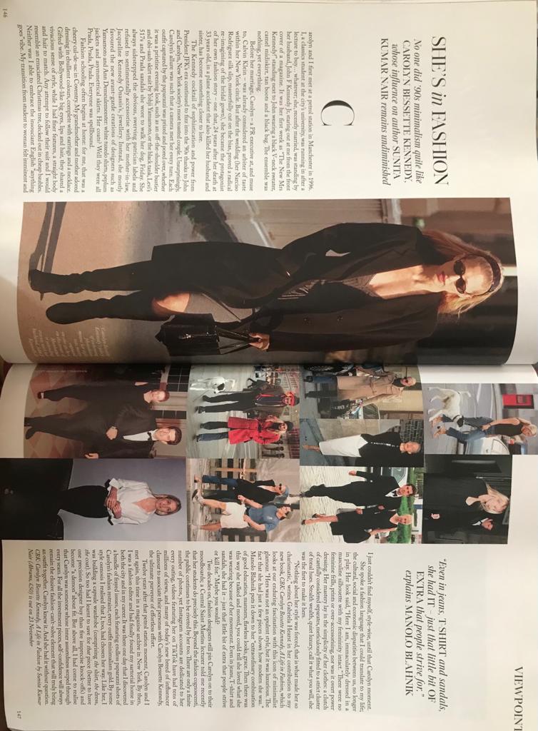
Images: | Total: 10 Pictures: Although a big amount, the pictures were made to a collage making it look as if it is ones which does not overflow the page with visual displays. All of the pictures were captures of Carolyn Bessette’s outfits that she wore from time to time. |
Layout | Good contrast between the proportion of images and texts, it doesn’t overwhelm the readers as portions of it are equal in both pages (half-half). Negative spaces in the surroundings is also used efficiently in a good amount, it doesn’t leave a huge gap in between images, texts, and borders of the page which highlights the reader’s attention more towards images and texts, although specifically images because they appear to be in the middle of the page which automatically grabs readers’ attention directly and they are also bigger than the texts. Drop cap and page number appears to be in their usual location, it looks professional from the font (serif). |
First impressions: | While scrolling the magazine when looking for a double page spread, I stopped in this page as it appeals to me. Out of 3 double page spreads in the magazine, this appeals the most and is my favorite. The image catches my attention as it highlights clothing, and the layout of the image is effective to grab attention as it is big and takes most of the page proportion. |
After Reading |
Heading: | “SHE’S in FASHION” |
Subheading: | No one did ‘90s minimalism quite like CAROLYN BESSETTE KENNEDY, whose influence on author SUNITA KUMAR NAIR remains undiminished. |
Author: | Sunita Kumar Nair (provided by the subheading) |
Article: | The article contains responses and praises towards Caroline Besset-Kennedy who is wife of former president of USA, JFK’s biological son, John F. Kennedy Jr. Caroline was complimented regarding her outfit and fashion that represents the 1990s minimalist wear. |
Mode of address: | Uses formal and intellectual word of choice, professionalism is indicated hence the formal tone. I don't really engage with the audience because the text does not use language like ‘you’ ‘us’ ‘we’ which is not a direct mode when addressing the audience. |
Pull Quote: | “Even in jeans, T-SHIRT and sandals, she had IT - just that little bit OF EXTRA that people strive for,” explains MANOLO BLAHNIK |
Audience: | Fashion enthusiasts |
Impression: | It seems a bit lengthy and boring although most double page spread articles use a basic blank white background with black text organized with a specific margin. This implies the professionalism and formality addressed in the text. Although the picture balanced out the texts and appeals to the audience’s sight when they first see this page. It is the right amount so the audience would not feel overwhelmed by the texts and have visual ideas regarding it. I like the pictures displayed in the double page because it looked like it was from a paparazzi instead of a standardized photoshoot, this presents realism towards the subject’s opinions and lifestyle which proves that the contents of the text is true (This was in fact Caroline’s fashion style and actual clothes she wore). |
Inspiration: | I learned that the visual proportion between texts and images need to be balanced in proportion. The text must not be lengthy and the images shouldn’t be completely all over the space. Negative spaces need to be wisely used to maintain balance between visual and empty spaces. This was shown throughout the page which is why I very much adore this double page, I feel like this double page is the one that attracts the audience more compared to the double pages that I found in this edition of VOGUE’s magazine, which is why I will consider to apply some features (that I mentioned before) of this double page to my own double page in my magazine. In a fashion magazine, the pictures of Carolyn were often a long shot because the image is trying to show her outfit which is more likely to be seen in fashion magazines which I will implement in my own. |
𝑺𝒆𝒍𝒇 𝑹𝒆𝒇𝒍𝒆𝒄𝒕𝒊𝒐𝒏:
Throughout the whole VOGUE magazine that I used as research for double page, this page peeked my interest the most. I really loved the format and the layout of this double page, it is thoroughly considered to evoke an appeal to readers. And because it is a fashion magazine, I would most definitely apply some of it features to my magazine project. The display of drop-caps, page numbers, headings, sub-headings, pull quote, negative spaces, the images, and most importantly the text taught me that it the proportions of this throughout the whole page gives a huge impact to how the audience are going to consume the content. I want my magazine's double page to be similar like this because I figured the features that created this page an appeal to my interest.
No comments:
Post a Comment