Tuesday, February 20, 2024

Magazine Contents Page Development

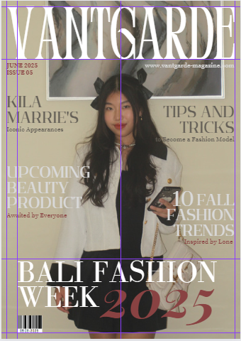
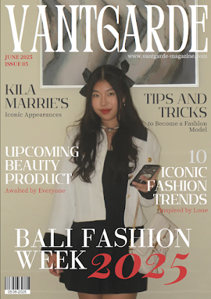
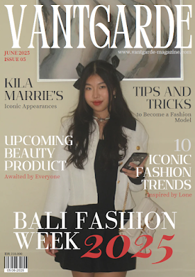
Here is my research and development for my front cover in my women's fashion magazine project. I have done the front cover research before but this is done more in-depth regarding to developments of the front cover.

𝑺𝒆𝒍𝒇 𝑹𝒆𝒇𝒍𝒆𝒄𝒕𝒊𝒐𝒏:

(P): The problem from the contents page development is that I was really rushing things in the last minute because I really dislike creating this particular page. Although it was as interesting as my double page and slightly better than my front cover but I really was stuck on this on as I didn't really have much inspiration on how my contents page should look. That is why my research is not as good as the double page. And, the pictures I have taken was limited and so I have to be resourceful when developing this page as the total pictures required are 4 images.

RESEARCH

Here is my research on elements of front cover on women's fashion magazine genre and layout/designs that appeals to be considered for my magazine's contents page.

Click here to view the Canva file of my contents page research. 

DEVELOPMENT

Here is the development including processes on creating my contents page, it captures the specific decisions I made in sequence.

SKETCHES

This is rough sketches I made before creating the digital layout. I apologize if they are messy.


CHOSEN ATTEMPT

I chose this layout because it was fun to make and I was rushing on things. 

These are the steps of creating the layout and design of my double page spread.

Step 1: Add borders, creating the title of the page and inserting the image
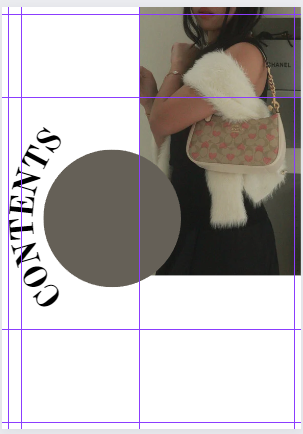

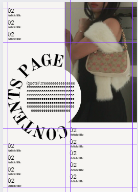
This was the rough attempt for my initial design made for the sketches. I played around with the title 'Contents' for my contents page as the conventions of a contents page usually includes the title for every magazine. However, I develop the conventions further by shaping the title/heading a bit curvy subverting the typical aligned heading at the top. This is done because I find it very pretty, I like the design of it and I would like to give the impression to the audience that my magazine is unique, by means that I will still be following typical conventions found on women's fashion magazines but altering some of the layout to remain interesting and different than others. I also added borders to ensure the alignment of the text and page number later on through the development.
(P) Here I think that the circle looks weird with that color, I inserted this circle because I planned to put a small text regarding the magazine that addresses directly to the audience (e.g. inspirational quotes), this highlights a message from the magazine to the reader as it quotes from another person that they look forward to (role model, Two-Step Flow). And the heading doesn't really fit to the shape.
(S) But this is just the start as I was just trying to collect ideas how to display my rough plan for the real magazine.

Step 2: Change the color of the circle and shape the heading
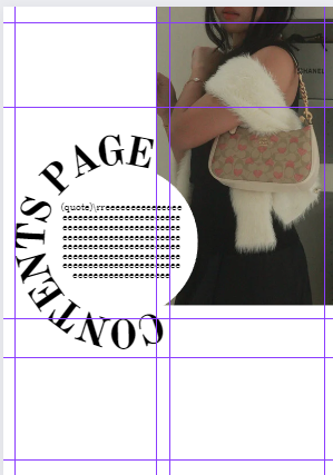
I had changed the headings from 'Contents' to 'Contents Page' because I found it to fit better to the shape as using just 'Contents' is a bit too short. The whole heading shapes the circle as I changed the color of the circle to blend in to the background color. I added where I want and how I want the text inside the circle to look like but I haven't figure out a quote to insert here so I'll leave it for later to research and put random letters just to give me the idea of the whole layout. 

Step 3: Changing background color and adding texts (article title and page numbers)
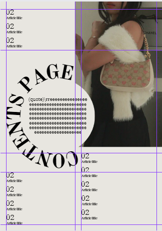
(P) I didn't really like the color 'white' for the background of the contents page because I figured that it didn't match the front cover. The front cover's color palette was really toned down, that's why the color white for the magazine title appeared more as it was brighter than the background color. But if I use this for the contents page, audience would be confounded by the fact that the color doesn't match the theme from the front cover making it seemed unprofessional. I also had problem to name the article titles for my magazine and their page number so I left the same prompt until I figure it out.
(S) So, I eyedrop the background color of the front cover background and made it brighter. Therefore, the conventions of using neutral colors as background of magazines was still conformed but still matching the themes visually.

Step 4: Increasing the size of article titles and their page number
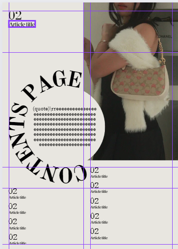
I had consulted with my teacher regarding the rough attempts of the layout and he said that the article title size needs to be bigger. I agreed to this because audiences are supposed to be aware of the page number as contents page are usually searched for information within the magazine, therefore it needs to appeal to their eyes. 

Step 5: Finalizing the details

In this version, I had made many updates to my contents page directly. 
  • Increase size of the article titles and the page numbers
  • Add more borders (rows and columns) for better alignment of the titles
  • Inserting the page number chosen to be featured on the contents page
  • Inserting the article titles that I had choose
  • Inserting a quote from a famous fashion designer
  • Filling in blank space between image and text with a caption for the image
The use of the quote from Vivienne Westwood (famous fashion designer) engages with the target audience (fashion-enthusiasts) as she might have been their role model and a person they look up to. This inspirational figure for fashion-enthusiasts might inspire them regarding to their passion of fashion, this supports the target of my magazine which can be explained by the Uses and Gratification theory (Blumler and Katz) within the application of personal identity from role models and inspirations for consumers. Moreover, mentions of celebrities (fictional or real) also supports this use of theory and how audience are targeted for this magazine. The articles featured on the contents page also conforms to the generic conventions of themes and topics discussed in fashion magazines. 

FINALISING

Here is THE FINAL CONTENTS PAGE.


AD FOR THE CONTENTS PAGE FILLER

This is a picture that I took that I had chosen to be the ad for the filler page in the contents page. 
As I have limited pictures for my magazine project, I used this picture for an advert in this magazine. I wanted to feature the brand 'COACH' for the ad as the model is holding a Coach purse. However, I found out that there are props behind the model that includes other brand which may have affected the adverts. So I edit out the brand names and insert the logo of  'COACH' that I had found in Google.


FINAL

This is the final look for my magazine's contents page.

First page (AD):

Second page (Contents page):

Compiled:


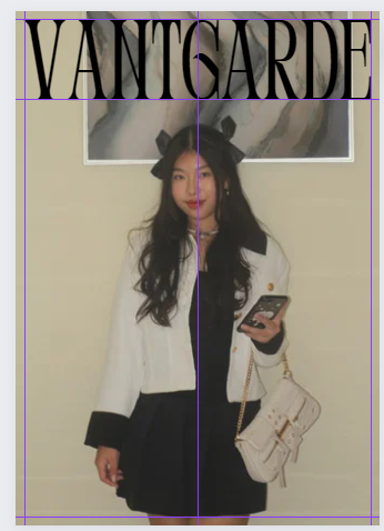
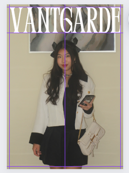
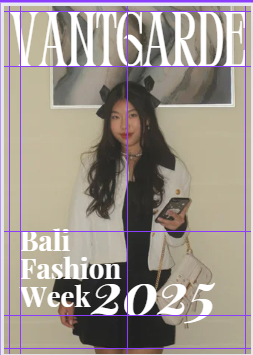
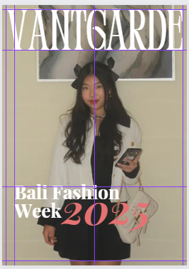
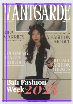
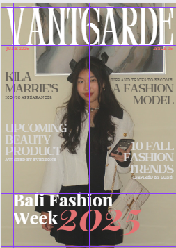
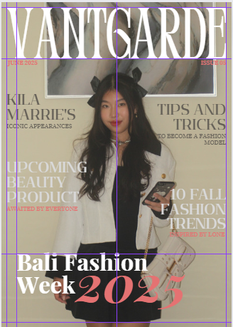
Magazine Front Cover Development

Here is my research and development for my contents page in my women's fashion magazine project. I have decided to separate my research and development from my front cover research to help me separate them and be more organized. 


Self reflection:

I didn't re

RESEARCH

Here is my research on elements of contents page on women's fashion magazine genre and layout/designs that appeals to be considered for my magazine's contents page.

SKETCHES

This is rough sketches I made before creating the digital layout. I apologize if they are messy.


Here are the final 3 that I have considered so far along with notes and comments from me.


DIGITALISING/FIRST DRAFT

After sketching, I decided to try out the layout digitally to see how it'll look. But I didn't insert the coverline nor the main coverline because I didn't have any idea yet to what I want it to be and it was also a rough attempt. 

Here are the digitalized drafts.

1. 
2. 
3. 


CHOSEN ATTEMPT

These are the steps of creating the layout and design of my double page spread.


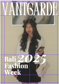
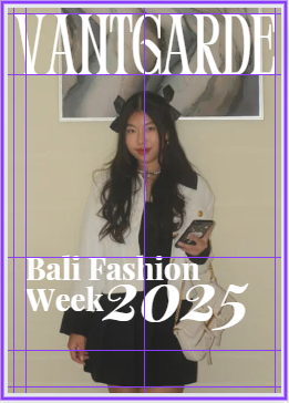
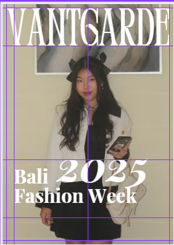
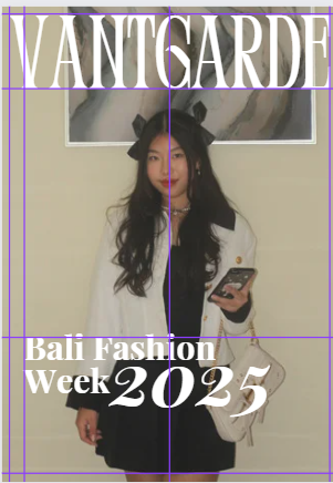
Main coverline:

Size and layout:

Wednesday, January 10, 2024

Component 1: Location Scout & Risk Assessment

Here is a list of locations I’ve considered for my magazine cover photoshoot along with an individual evaluation consisting of the potential risks, hazards, and benefits of the setting. 


Component 1: Location Scout


Here is a list of pictures of location/background that I considered for my magazine’s cover photoshoot.

Indoors 

1. Sofa/couch


2. A blank wall 


Outdoors

1. Grey wall


2. Little street - Jln. Tukad Unda 


Thursday, November 9, 2023

Component 1: Double Page Spread Article Draft

 Here is my draft for my double page spread article, regarding to my magazine's main coverline.


𝑺𝒆𝒍𝒇 𝑹𝒆𝒇𝒍𝒆𝒄𝒕𝒊𝒐𝒏:
During my first lesson of developing the article draft for my magazine's double page spread, I really struggled in finding the topic that I would like to discuss about. Options that I considered was either a review or an interview because I did not think that other article topics were suited for my magazine genre which is a fashion and lifestyle magazine, this was because during my researches I have found and observed that the articles are mostly a review of an appearance from a fashion critique discussing showcases of fashion. I think I applied the Genre Theory (Neale) as I want to present my magazine to the general audience of a fashion magazine (fashion enthusiasts, designers, etc.) which proves his statement regarding the similarities of genre conventions to remain noticeable to the accustomed audience but remain different to appeal interesting. And so I decided to review a fashion event created from a famous fashion designer. Throughout the writing process, I mostly experienced a brain-dead situation when I don't know what to add to my paragraphs, I was lost in words to explain what I wanted to elaborate on the fashion event topic I discussed. Although, I kept using generic vocabularies and then searched in an online thesaurus for a synonym for words that I used too much to not bore the future readers if I repeated a word too much. By the time I was finished, I checked the spellings, grammar, and punctuations used in the draft but I think there were little to no mistakes which I will review later on when I start to finalize my actual magazine. I needed to stay on track of my timeline because I finished this draft a little bit later than usual. Therefore, I need to improve my time management when developing the final magazine to collect my project on time.


Title/Heading: Bali Fashion Week 2025: Through the Eyes of Navy Susanne
Subheading: A hit success in showcasing Southeast Asian culture in contemporary mode
Pull Quote: “to represent how cultural heritage may be worn and showcased by whoever and wherever,” 

Topic: A review of a cultural fashion event held by a famous designer and a brief overview on the 2025’s ‘Bali Fashion Week’ and the iconic appearance of a famous celebrity/model.
Tone: Mixed (language addressed formally, in an informal toning style)
Mode of address: Indirect 

        By the east of Java Island and west of Lombok Island, Bali, the famous tropical island in Indonesia, has been growing in popularity from their appeal to the western population. Known for their diverse rich culture (building engravings, artwork, dance, and drama), countries from all over the world admitted and acknowledged their sophistication in the field of artistry. Their talents and skills in craftsmanship had excelled to engrave the balance between art and culture. Hand-woven tapestry like sarongs weaves connections between artistic and religious customs that balance out perfectly, sarongs worn by men and women enables a wider accessibility for humanity to express themselves with respect in regards to social and cultural beliefs. This would also be further proven from Balinese dances and gamelan music performed in tourism locations and importantly sacred temples. The performance of this heritage encourages appreciation from tourists as the implication from their beliefs, folklores, and mythology through a crafted, intricate dance between tradition and innovation, preserving ancient techniques while embracing modern forms of expression. 
        Even their architecture had inspired many known designers like Navy Susanne who’s famous for her unique garments under her own name. Temple engravings had inspired her latest collection including garments that showed patterns and motifs symbolizing the temple walls, depicting stories of gods, heroes, and nature, creating a historical significance through the contemporary fashion trend. Many fashion critiques had been interested regarding this couture, which brought other fashion experts to follow this design. This trend had appeal to the whole world, increasing Bali’s popularity.
        Regardless, it indeed has shocked the world when Bali’s art has been revealed to the world as what they don’t realize that their art and culture had transcended throughout eras while still being to appreciate cultural heritage and keeping up with the contemporary trends. From your local fashionistas to western designers have been coming to Bali and observing the wonders of their art themselves. Bali’s population had increased for the moment, which enticed Navy to change her fashion event conduction idea and move its location to Bali.
        In tribute to the Balinese culture, Navy initially created a ‘fashion week’ idea to promote cultural backgrounds to people with interest of fashion as representative for them to express who they are, although this idea was further added the cultures from Bali and changed her target to promote the Balinese culture in modern and contemporary ways in fashion. This idea was then developed in early 2023 and was initially launched on the 25th of May, 2023. The first event was then fully occupied by people from all over the world. In the first event, Navy planned for her guests to wear exquisite garments appreciating the Balinese culture in the theme ‘Folklore & Legends’, this was implemented from depictions of the guests’ costumes from multinational designers, which were fantastic as the first launch of this fashion event and satisfied international fashion critiques. Her fashion week idea was claimed to be informal and does not require specific dates and invites to be able to attend and watch the parade with ticket payments, of course, however guests who are running in the walk were personally invited and listed. Navy officially named her event ‘Bali Fashion Week’ and confirmed that it will be held in Bali annually.
        The 3rd Bali Fashion Week, which happened recently in 2025 on the 6th of May, has been a major success within the local fashion industry. With the theme ‘Elegant Engravings’, guests from all over the world, famous actors and actresses, supermodels, and other celebrities, a homage to the imagination and creativity in tribute to rurales and carvings. Based on Balinese histories, the engravings were made according to the rules, style, guidance, and rituals of Balinese architecture whose designs were consulted by famous Balinese architects to ensure the preservation of the true cultural heritage. In a recent fashion extravaganza, celebrities wore garments embroidered with motifs inspired by the sacred carvings of Balinese temples. The event displayed a balance between cultural heritage and high-end style, where the rich history of Balinese artistry met the glamor of celebrity fashion. The fusion of these temple-inspired engravings with rural elements in the garments showcased a poignant narrative. Embroideries evoking lush Balinese landscapes, vibrant flora, and mythical faunas of rural tribute to temple motifs. The juxtaposition of these elements added depth and layers of storytelling to each ensemble, elevating them beyond mere fashion pieces to intricate works of art.
        As celebrities paraded down the runway, the convergence of ancient Balinese culture with the glamor of the fashion world was evident. It reflects each of the celebrities’ personality and traits presented in the beauty of fashion.
        One of the most iconic appearances was presented by Kila Marrie, famous supermodel and top-tier movie actress. Her attire was personally customized by the mastermind of the event herself, Ms. Navy Susanne. Kila and Navy has always had a special bond and was always invited to attend and walk on the red carpet in every BFW she held. Kila thoroughly thanked Navy for her accomplishments in mode, “I really respect her and look up to her, I felt so honored when she invited me and asked me directly to represent my people, my background, and my culture.”
        Grace was embodied by Navy in a dress that was a tribute to cultural heritage and architectural opulence. Her corset design reminded of the sculptures that decorate the ancient temples, and each stitch was woven with the essence of tradition and historical significance which is a testament to the Navy's honor for cultural stories.
        Under Navy's instructions, this dress was more than just material and decorations. It turned into a wearable work of art, a tribute to her creativity as well as her deep regard for architectural beauty and historical heritage. “It was a simple attire that I feel anyone could be wearing anywhere, that’s the idea, to represent how cultural heritage may be worn and showcased by whoever and wherever,” Navy said in regards to the design. Her design was an outstanding representation of heritage in the world of fashion, demonstrating Navy's artistic ability and respect for ethnic differences.


Wednesday, November 1, 2023

Component 1: Technical Skill - online

 Here is the process of how I developed my technical skills when encountering difficulties.


Problem 1: Resizing the display of Google Docs embedded file in Blogpost

𝑺𝒆𝒍𝒇 𝑹𝒆𝒇𝒍𝒆𝒄𝒕𝒊𝒐𝒏:
This problem was encountered by all of my teacher's students in Media Studies class. However, the solution to this problem was identified quickly with the use of contemporary technologies that we can access anywhere and anytime regarding to anything. The YouTube video I watched from my teacher's and friends' suggestion was affective and lead to me being able to develop a new technological skills (writing a code). This was fun as it was easy to learn and was efficient to fix the displays in my blog.

There are several blogposts that requires the embedding of a file to blogposts to showcase a certain file and make it appear when reading my blog. I have encountered and master this skill although only from Canva and Google Slides file. It was quite easy, just to copy and paste the embed link. I did that same procedure on my Google Docs file although the appearance of the file is displayed smaller and couldn't be read by viewers. This was a problem for the whole class.
Eventually, our teacher had solved this problem by suggesting us to watch a YouTube video. And so I did.

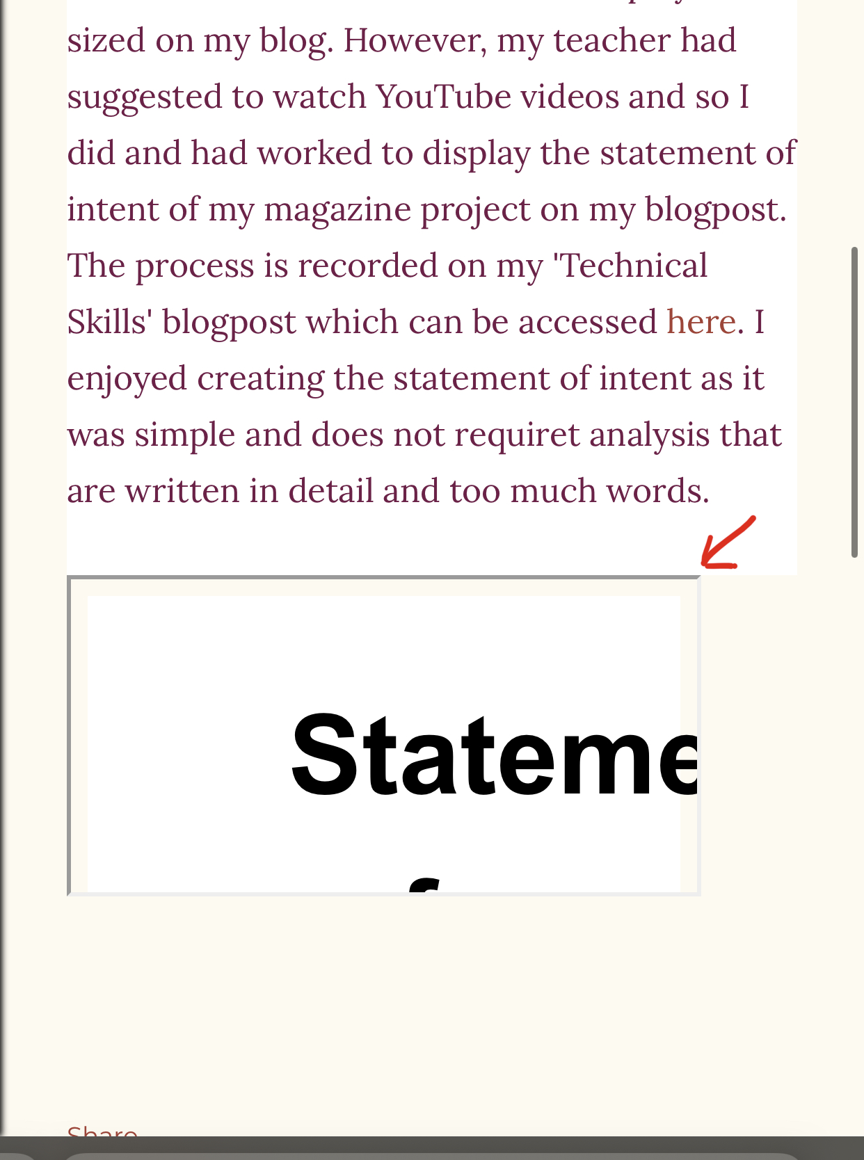
The image below was how it looked before I fixed the sizing of the file.


I tried the usual way from my Google Docs file to obtain the embed file link by:
1. Clicking 'File'
2. Click 'Share'
3. Then click 'Publish to web'

Afterwards, we're supposed to pick the 'Embed' selection and copy the link provided. Then we paste it to the 'HTML view' of our blogpost draft. 


This was the very exact procedure I underwent for embedding my 'Brief' blogpost. However, the display was small and couldn't be edited by dragging the size of the image.


Final Solution:
After watching videos on how to embed a Google Docs file, I obtained the procedures to correctly embed the file:
1. Undergo the same procedure to obtain the embed link from the Google Docs file. Then copy it.
2. In the HTML view of the blogpost draft, paste the link.
3. After the "<iframe" code, add [ height="..." width="..." ] which is a code to determine the size in height and width of our embed file. The sizing are based on our own preference but I choose the height to be '500' and the width to be '700'.
5. Update your blogpost.


It should look like this afterwards.


Here is the link to the YouTube video I watched https://www.youtube.com/watch?v=Bhj-BtJMpyg.


Component 1: Terminologies

Here is a list of terminologies created by my Media Studies teacher (Mr. Nick) that I learned during class.


𝑺𝒆𝒍𝒇 𝑹𝒆𝒇𝒍𝒆𝒄𝒕𝒊𝒐𝒏:

I was able to understand the features of the magazine and its effects by memorizing the vocabularies in the list below that out teacher had provided us. It was an effective method to remember the terminologies quickly. I enjoyed when memorizing this vocabulary as it adds a new knowledge for me. However in my first attempt to name elements of the magazine I brought, some features are not included in some magazines that made me to not know how some of the features look like. But then our teacher and my classmates shared magazines to be presented to each of us and was shown how features would look like in the magazine. Example, not every magazine includes a 'skyline' (mines didn't) so I didn't really understand how it looked like. But after I borrowed others' magazine. I was able to identify and recognize it/


Masthead 

The name of the magazine, in its typical font, on the cover. 

Selling line 

The short description of the ‘identity’ of the magazine under the masthead, 

Main image 

The image which fills the cover – a model, celebrity, animal, artefact. 

Coverlines 

‘Teasers’ for the contents of the magazine on the cover. 

Typography/font 

The shape, style, size and colour of the letters used. 

Drop cap 

The enlarged initial letter of the first word of an article – an aesthetic feature which is designed to engage the reader. 

Pull quotes 

Enlarged quotes from an article – these may be included in coverlines, but are also used in the body of the article to break up the page and to attract the attention of the reader. 

Byline 

The name of the writer of the article, usually found at the beginning. Simply, it is the ‘line’ which tells you who the article is by. 


Strapline

Memorable phrase that is associated with the magazine.

Cover line

Titles of stories featured in the magazine 

Main cover line

The most important article featured, grabs the audience’s attention (featured article)

Main image

The dominant image on the cover

Barcode

Used for retailers

Skyline

A list of keywords featured at the top of the cover

Thirds

The upper and left third are the most important. why?

Prop

An image of an item

Puff / Boxout

A smaller image/text to stand out from the rest of the information (puff=circle. boxout=square)

Buzzwords

Exclusive, free, new, special edition

Banner

A block of colour with info inside, usually stretches the width of the cover


Headline

The title of the article

Subheading

Additional info found beneath the headline (Crosshead)

Byline

The author of the article 

Pull quote

A quote taken from the article, with the font/size colour changed. 

Drop Cap

The first letter of the article enlarged. 

White space

Empty space in the spread, used to break up the content (negative space)

Border

Empty space around the edges

Column

Standard layout of magazines

Spread

Pages of a magazine that should be viewed together (usually two)

Caption 

Information about an image. 

Mode of address

The way the magazine/article addresses the audience. Formal, casual, direct (for images too)