Thursday, October 3, 2024

Component 3: Team

This is my team for my documentary project. This blogpost is written by me (Audrey).


Kalista, Chelsea, Rara, & Audrey (left to right)


We decided that our group name would be MG25 (Media Girls 25').


---------------------------------------------------------------------------------------------------------------------------------------------------------------


Here are the links to my team members' blogs:

Chelseahttps://chelstirta-regentsmedia.blogspot.com/

Kalistahttps://kalistaa-regentsmedia.blogspot.com/

Rarahttps://luvraa-regentsmedia.blogspot.com/


---------------------------------------------------------------------------------------------------------------------------------------------------------------

𝑺𝒆𝒍𝒇 𝑹𝒆𝒇𝒍𝒆𝒄𝒕𝒊𝒐𝒏:

This was my second time with Kalista, Chelsea, and Rara to create a Media Studies project as a team. I am excited to work with them again as I was already familiar with their capabilities and skills which is really beneficial when delegating tasks and roles for the group's responsibilities. I am satisfied with this choice of being in the same team and I am confident that our results would work out perfectly since we all recognise each other's working style. 
It took a while to decide that we wanted to remain within the same group as other students had discussed and requested to be with some members in our team. We initially thought that we were going to be separated for the Component 3 project. But at the end, we chose to stay as we all have the bond and trust already. We all have the same target to achieve great scores for our project even if only some of our members (Kalista and Chelsea) are taking the exam. However, me and Rara are going to keep doing our best and put in our maximum effort as we also strive for good grades.

Problem (P): The only problem identified is that we all have our own schedule and we are all busy. We have our own extracurriculars and both inside and outside school responsibility that inhibits us to work together as team at the same time and maximise our group discussions. 
Solution/Action plan: Me and my teammates would communicate well if we aren't able to do or come for discussion/planning/production if we are sick or busy. We inform each other regarding to requirements and instructions from our teacher if one of us were unable to attend school and missed a lesson. Overall, we will continue to work together efficiently to produce the best result for our project.


Component 3: Music Video Project Brief

 Here is the brief for my music video project (Component 3). This blogpost is written by me (Audrey).


---------------------------------------------------------------------------------------------------------------------------------------------------------------

𝑺𝒆𝒍𝒇 𝑹𝒆𝒇𝒍𝒆𝒄𝒕𝒊𝒐𝒏:

When our Media Studies teacher (Mr Nick) had introduced us to the brief, I was excited to start Component 3 in which we are assigned to make a music video. Music video is a popular media text in society which means that everyone is familiar with this media text. I am quite familiar with music videos although I hadn't explored its conventions in detailed. I am excited to gain more knowledge throughout the development of this project and hoped that I can learn a lot from this. I will try my best to prepare and become knowledgeable regarding this type of media text (music videos) in order to maximize the grasp of my understandings to be able to implement it for our music video project. I need to conduct more research regarding music videos and the genre of my choice so I can set both myself and my teammates for goo expectations of the results and achieve satisfactory level at the end. I need to be able to manage my time well so that I don't rush at the end to get a good result and near-perfect grades. I understand that it takes so much time to complete this project (Component 3) and I have learned from previous experience to prepare beforehand. However, I am not excited to make my critical reflection and I am not excited for the long hours of writing blogposts one-by-one. I hope that I can manage and keep up a good performance throughout this whole process.

Tuesday, September 10, 2024

Project Doc: Final Documentary + Thumbnail

Here is our final documentary and thumbnails. This blogpost is written by me.


Final Crime Documentary Opening 

Here is the YouTube link for our final documentary.
Here is the Google Drive link in case there is an issue.


Final Thumbnail 


Here is the link to Google Drive in case there is an issue on the display.


Netflix Mockup


Monday, September 9, 2024

Project Doc: Critical Reflection

Here is the critical reflection for my documentary project. This blogpost is written by me (Audrey).


I will be answering these questions for my critical reflection (not by sequence):

1. How do your products represent social groups or issues? (CR 1)

2. How do the elements of your production work together to create a sense of ‘branding’? (CR 2)

3. How do your products engage with the audience? (CR 3)

4. How did your research inform your products and the way they use or challenge conventions? (CR 4)

    As outlined by the brief set by our teacher, Mr. Nick, we had to create a 3 to 5 minute crime documentary opening. My team, Chelsea, Kalista, Rara, and I, had agreed to create a crime documentary with the subgenre of true-crime involving a murder. The plotline and events follows a murder of a teenage girl who is about to enter a new beginning of getting into a university with her best friend however involved in online dating which led to her uncanny death. In this critical reflection essay, I will discuss further on our product including the production stages and how we incorporated technical elements to conform and subvert conventions within the genre as it appeals to our targeted audience.
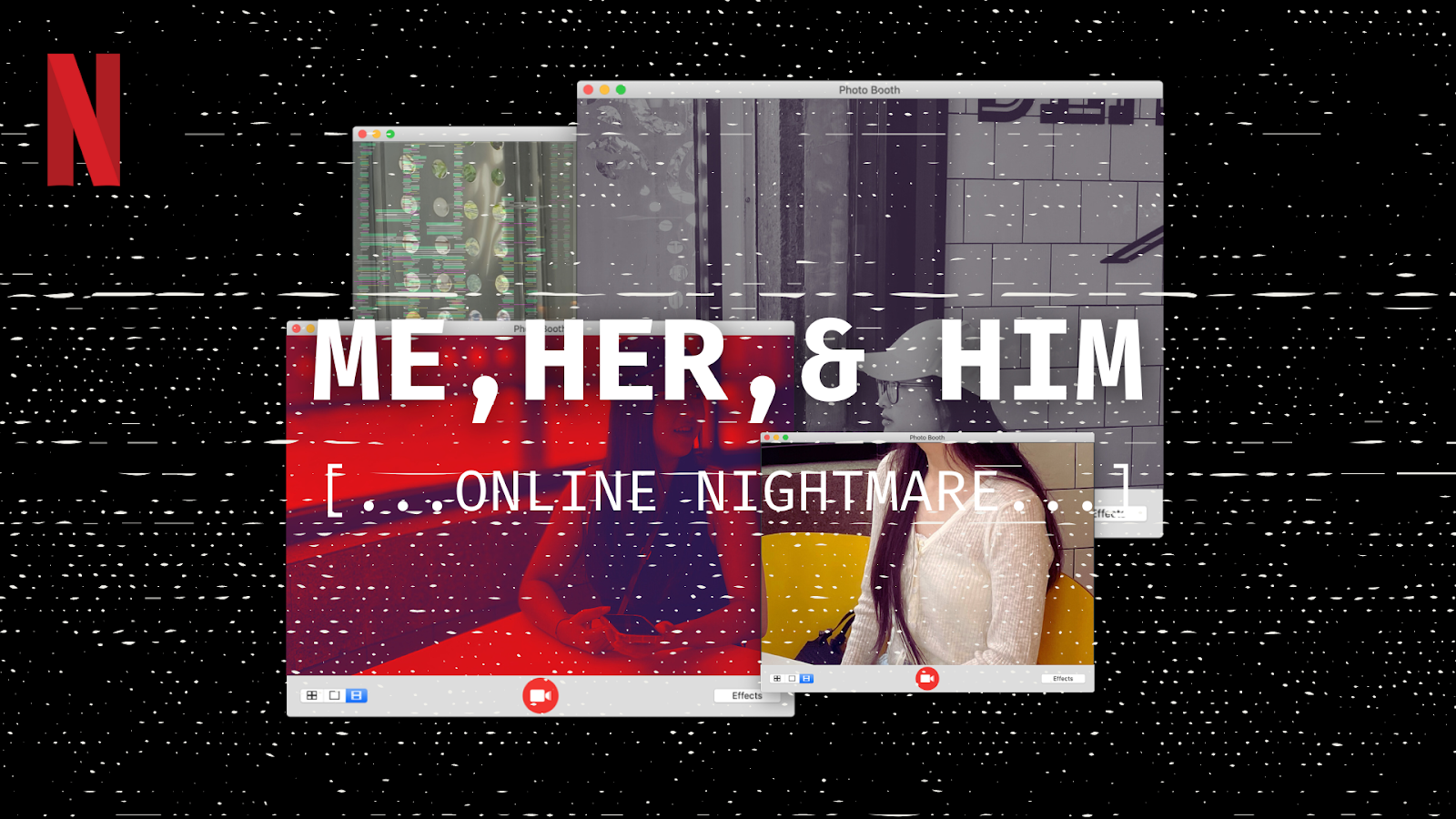
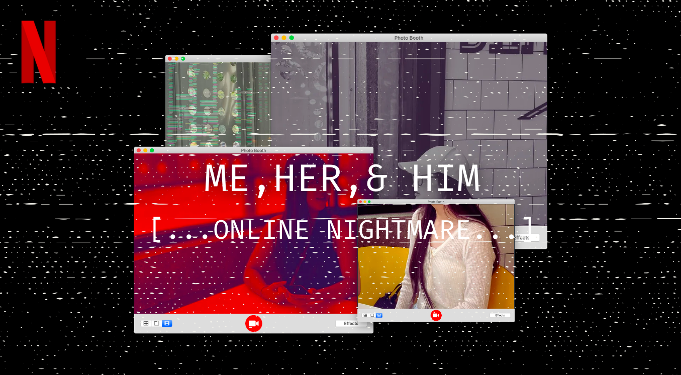
    The use of branding is crucial in order for a media text to be recognised as it strengthens the public perception of how they infer our intended messages. According to Stuart Hall’s Reception Theory, meaning isn’t simply given by the producer for the audience to accept straight away. The audience plays an active role in how they interpret, respond, and decode  to the messages. Our intended preferred reading was that we should be careful with toxic friendships. The technical elements used to convey this message was through the use of real footage such as vlogs and hand-held camera movements which connotes realism and authenticity implied from the bond between the two leads. Moreover, the overall theme of our documentary was ‘nostalgia’ which can be decoded by the audience through the use of vintage color gradings and video effects. We chose this as it is one of the recurring themes, popular amongst the young adults community which would be the demographic to our target audience. This mood conveyed was also kept consistent on the documentary’s thumbnail. Our thumbnail includes layered photobooth tabs of the same image including the two leads within a mix of effects, this would connote different realities and/or perspective from one story. This follows the theme of digitized media platforms in our documentary including social media pages, phone calls, and view of a desktop that is being portrayed in our project creating a visual similarity between the thumbnail and the documentary. This theme was chosen specifically as we targeted an audience who are knowledgeable and have access to modern media which may have personal experience evoking a connection between the narrative and reality. Another visual similarity identified for the audience to recognise is the use of typography on the thumbnail and the end of the opening scene (title card) of the documentary.
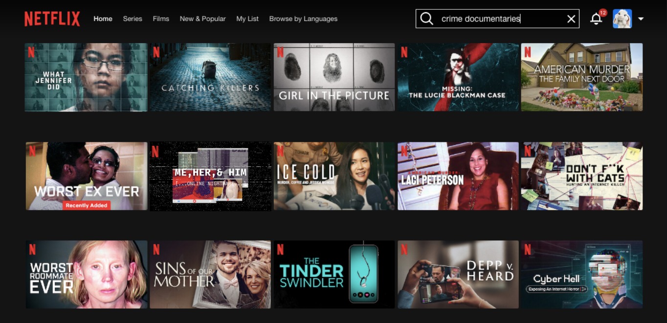
The text was purposely written in all capital letters as we found that it is one of the conventions of a crime documentary. We decided to conform to these conventions as according to Neale's Genre theory, a media text must be similar to be recognised by the target audience. In this case, from Netflix’s search page, we found so many crime documentaries with monochrome, all capital and bold text titles, this is because it is easier for the audience to spot and click on the thumbnail which increases the audiences’ engagement. To elaborate further on Neale’s Genre Theory, a media text must also be different in order to be distinguished with other products to appeal to the audience and remain interesting. Here, we subverted the usual narrative of crime documentaries by not specifying and revealing who the assailant was in our narrative. This keeps the audience guessing as the messages conveyed acts as a hermeneutic code (Barthes Narrative Theory) which raises curiosity keeping the audiences engaged throughout the narrative.
    Our own crime documentary opening research helped us to further explore the conventions of technical elements in a crime documentary helped us decide which elements to input to add suspense. Firstly, our documentary had used a fair amount of real footage and clips (CCTV/surveillance camera and archival pictures) of the events and associates, along with the documentation which connotes realism and authentication evoking a sense of trust of the audience connecting us, the producers, to the audience allowing messages to be conveyed and decoded easily. In this case, there are easter eggs included in screen-recorded scenes. Here, the use of the number ‘4’ which is commonly associated with death in the Chinese-Indonesian group which were heavily represented in our documentary. This implies that something terrible, death, had happened to the main lead (Sasha). According to Hall’s Reception Theory, the audience does not fully interpret media messages as whole, our audience are able to interpret these technical elements and decode them as we provided a meaning. 
    Our documentary revolves around South-East Asians (Chinese-Indonesian) leads. In the media world, the majority of media texts such as movies, TV programmes, documentaries, and others are commonly presented with the conformation towards Hollywood/Western traditions which dominates the entirety of narratives, reflecting a strong and dominant image of Western cultural groups. Our documentary subverts this stereotype as the portrayal of a minority group (Asians, specifically South-East Asians) becomes the central focus on the narrative. South-East Asian aren't popular to be represented in media texts, traditionally, this ethnic group are underrepresented as leading roles are less likely to be given to Asian casts with less hegemonic power. South-East Asians are commonly given background roles in the media as they don't play a significant role in media which increase awareness and avoids invisibility and ignorance of the group. However, our focus on the narrative perspective through South-East Asian would give the audience more attention to the reality which evokes a connection from the audience from our story. Moreover, this media text subverts the depiction of the group for being represented just for diversification of casts to appeal in modern media to appeal to the public's recurring interest in integrated diversity themes. This prevents the issue of tokenism from being arised from our product as our South-East Asian leads weren’t portrayed overly exoticised and used for diversifying cultural background as we focused on the complexity of the individuals. To start, the main lead (Sasha) is depicted to be friendly, genuine, and gullible which was connoted by the often use of light-coloured clothing (Mise-en-scene) which symbolises innocence. This was a juxtaposition to her best friend who was the actual killer, presented with dark clothing which symbolises her darker intentions. Lastly, the love interest was purposely intended to deceive the audience into believing that he was the killer when he’s not. This may be decoded through his name ‘Kyler’ which we intended to make it sound like ‘killer’. This was further implied by the character’s personality that is dishonest and suspicious as he serves to represent the risk of online dating for teenagers. Overall the main theme of this documentary is trust which is a common issue faced by young adults which may reinforce a connection from the audience to the narrative. The decoding of the message may relate to the Uses and Gratification Theory by Stuart Hall as the messages serves as the Personality Identity aspect of this theory which the audience may feel connected and empathise with how their group is represented and reflected reinforce identities are valued in these era of Western culture dominance.

Thursday, September 5, 2024

Project Doc: Thumbnail Research + Development

Here is my research on crime-documentaries thumbnails which includes the development process of our documentary project's thumbnail. This blogpost is written by Rara, Audrey. However, we all discussed this together as a team.


---------------------------------------------------------------------------------------------------------------------------------------------------------------

Here is the research for crime documentary thumbnails conducted and reported by Rara.

Starting off with an overall overview of what crime documentary thumbnails look like on Netflix 
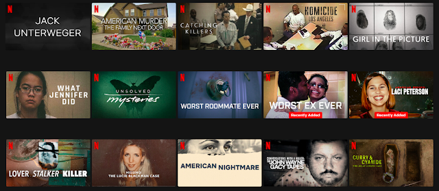

Crime documentary thumbnails stick to several conventions. As it helps show what kind of audiences it's trying to target and is the key to pulling in viewers and letting them know what to expect from the documentary's theme and style. First of all we can see that most thumbnails follow the same convention which is by showcasing the face of the main character most likely the perpetrator or victim in a very close up camera angle (direct mode of address) which helps to imply how their emotions give off a sense of secrecy or intimidation. Most of these thumbnails also have a bold/dramatic typography in bright colours (white, yellow, red) in front of dark backgrounds this ensures that the viewers can easily read the text and help convey the message that the word that is emphasised is the main subject of the documentary. Most thumbnails also use a very dark colour palette with shades of grey, black, red, deep blue in order to convey mystery, danger and seriousness. 


Here are two examples that mostly peaked our interest:
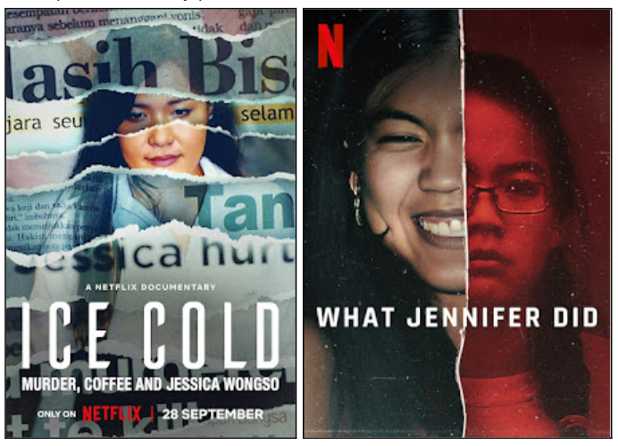
Here are 2 documentaries in which the thumbnail really intrigued us which is "Ice Cold" and "What Jennifer Did". These 2 follow the typical convention of a crime documentary thumbnail, however "Ice Cold" uses a different approach which is by making it look like it came out of a newspaper and how it uses separate pieces to convey that this person's story has become well known in different news outlets and that this documentary will shine light on each person's perspective within her story allowing the viewers to not be deceived by other media outlets as they shine her on a different limelight. We liked how both documentaries have a very stylistic choice in the picture and layout which is what stood out the most for us. However we believe that creating a thumbnail similar to "Ice Cold" would be quite difficult and time consuming as for "What Jennifer Did" it wouldn't be possible for us to do as the main story of our documentary is about 2 best friends meaning we want to put 2 people as the main focus not just one. 


But here is the thumbnail that we will most likely follow
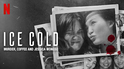


Typography: The title "ICE COLD" is in big, bold, all-capitals font, a clean sans-serif typeface. White text on a dark background helps significantly in readability and gives that stark, cold feeling that agrees with the theme of the documentary. The subtitle "Murder, Coffee, and Jessica Wongso" follows in smaller font, indicating its the subheading from the main title. Typography that feels razor-sharp and stark brings out how dead serious this subject matter is.

Colour palette: Its palette is mainly shades of black, white, and gray to give that cold and sombre atmosphere. The grayscale brings in the documentary and archival feeling; it is as if we are looking at memories of the past. The blood splatters in red create a striking contrast and forthwith direct one's attention to the aspect of violence or crime. The red will add a sense of urgency and danger to the whole composition, which goes in tune with the murder theme.

Lighting and Mood: The general lighting is subduing, moody, and grainy, adding to the dark forbidding tones of the documentary. In addition to the muted lighting, the use of black-and-white photography may suggest a nostalgic, reflective feel; however, blood splatters thrown into this otherwise subdued palette introduce an element of disturbance, an indication that something truly nefarious lies beneath. Choices in lighting and mood create tension on the events that are about to unravel .

Imagery: The most prominent part of the thumbnail would be the two girls with layered photographs of them. The usage of photography would depict personal memories of  when the two best friends were happy together, which would add emotional contrast to the darker elements in the thumbnail. Casual and carefree expressions in the photos, contrast with the violent connotation of blood splatter, which may indicate a tragic twist in their story. It is this conjunction of violence and innocence that stirs any viewer's mind to want to know the background information for the documentary.


This is another version of the "Ice Cold" documentary thumbnail. We as a team will mostly try to make this kind of thumbnail because it aligns with the main plot we're going for which is 2 best friends and an online boyfriend. So by showcasing pictures of the 2 best friends together it gives off the impression that they're very close but the audience will question if they're that close what could possibly go wrong


This thumbnail however gave us the idea of making a more digitised documentary as there aren't many that do this convention. So we mostly took ideas such as the typography and the effects from this movie. 
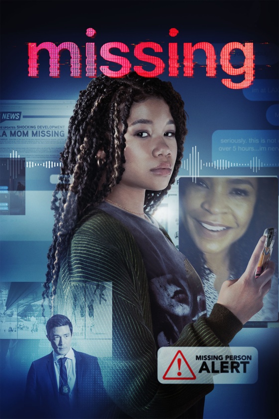
(An inspiration from a movie poster)


---------------------------------------------------------------------------------------------------------------------------------------------------------------


Here is the development stage for the title written by Rara. I helped on deciding the typeface.

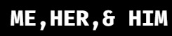
First we tried out different typographies trying to find which style fit best
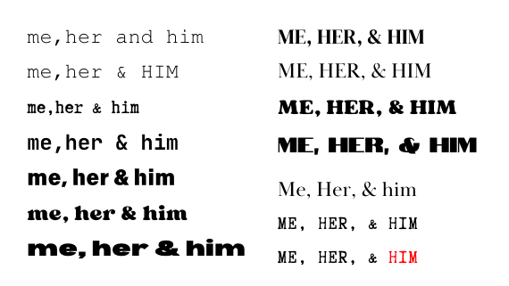
However after trying all these different fonts Chelsea gave us the idea to use a font that mimicked your iPhone chat (from a movie called “missing” look at the research above). As we wanted to follow the theme of a more digitised documentary. However this idea of having a more modern/digitised realistic typography was made after we had several drafts of the first few drafts of thumbnails. 


5 Finalised typography 
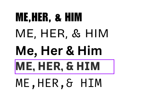
We liked how most were easy to read and how it matched up with our iPhone chats or fonts on your phone, but what bugged us the most was how the ‘&” on the first and second examples were very off and looked too artistic. 


So here is our final typography font for our thumbnail.
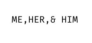
We decided on this font as we wanted a modern look but also incorporating that vintage style as this font is also used a lot in Instagram so it still fits our modern digitised theme. Although the title here is only shown for display of typeface, the colour, however, will be chosen and elaborated further as we discussed furthermore within the blog post.


---------------------------------------------------------------------------------------------------------------------------------------------------------------

Here is the development of the thumbnail written by Rara and me (Audrey).

Here is the first version and first attempt of the thumbnail design. Rara and Kalista had developed this idea which would be the original template of our thumbnail. 
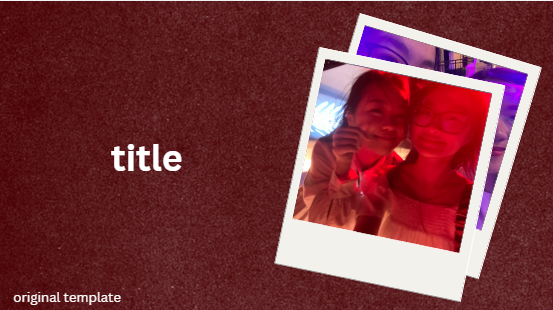

Here, we tried to replicate polaroid pictures of the leading characters (Sasha and Clara; Victim and Murderer) which would connote nostalgia and intimacy

The use of polaroid pictures evokes vintage vibes which is a popular aesthetic, or recurring theme in modern media texts, young adults are fond of. This will allow us to attract the targeted audience which would be young adults starting from the age of 17. The polaroid pictures also symbolises treasured memories from their friendship implying a strong bond between best friends, building an emotional connection between the audiences as it evokes their sympathy. Moreover, audiences would be more intrigued to click on our show as they might wonder what could possibly have gone wrong between the characters. Their curiosity for the juxtaposition between the warmth of friendship for a crime documentary genre as it connects to a darker message, would create a palpable tension as it creates an unsettling atmosphere. 

Although, our biggest concern here is that it does not look real which subverts the whole point of the subgenre of true-crime in documentaries inhibiting authenticity implied in our narratives. It is important to show realism as it is impactful to attract an audience, creating an emotional trust which would increase the engagement between them and our documentary.


From this, to further ensure that the thumbnail connects to our documentary and is in one theme with it, we decided to explore and experiment further to create more versions and options for our thumbnail.


Here is another version created by me (Audrey).
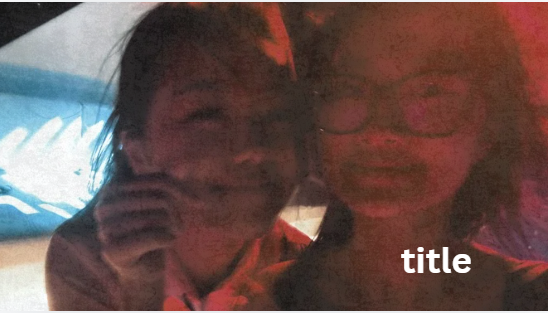
Many of us had been drawn into this thumbnail as it was simple but impactful. The use of the filter and layering of vintage photo effects would have a similar effect with polaroid pictures which I had described earlier in the previous design. I had taken inspiration from the polaroid picture and input it here to connote nostalgia. 

The layout conforms to the generic thumbnails of a crime documentary as from our research, we had found several documentaries’ thumbnails to be of a simple template, prioritising and focusing on a picture of (important) leads and the title itself. The reason for that is because it draws more attention from the audience to the leads who are keys to the events in the narratives. This simple layout was easy and quick to make.


I had tried to insert a Netflix logo on the top right corner as how crime documentaries are displayed on the official Netflix site.
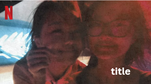
By doing so, this would make it seem like a real, professionally-made documentary which is why I had decided to include this Netflix logo for the final design later on.


Regardless, I had tried developing a few more variations from this design.

#1
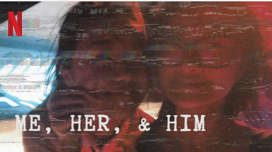
 

For the variations, I had experimented on a typeface which is discussed in the section above, however throughout the process, we hadn't decided on a fixed typeface for our title. We had developed this blogpost section beforehand. We all really loved this typeface but however our target audience were young adults and our documentary included clips of screen recordings such as calls and social media pages. This would disrupt the constant theme of digitalised media in our documentary and may also not appeal to our target audience as the typeface looks like a typewriter. It connotes nostalgia but this feeling may be evoked for older audiences as typewriters aren't common in this era. However, we kept it just to experiment before deciding on a fixed typeface.

This first variation would follow the theme of the documentary as it highlights ‘digital prints’ of the two leads. I imputed a glitched effect which connotes uncertainty and unsettling mood as it highlights malfunction and disruption which the audience may decode that there is something going on negatively between the two leads.


#2
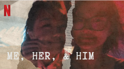
For this case, the overall comments on implications within the connotations were the same as the typewriter typeface. Our documentary presented a more modern era (digital) of mass media which means that this ‘ripped paper’ effect isn’t really going to stand out to audiences who are most commonly associated with technologies in this era. This was also a trial which explains why the effects aren’t properly organised to fit into.


#3
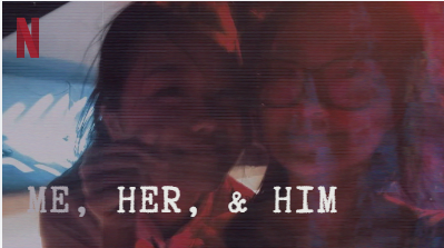
This was a more simple approach that I did within the variations. I personally enjoyed this but it seems that something was missing, and I couldn’t identify what. My teammates also weren't interested in this design so we decided to discard the idea.


We came up with a couple more ideas.
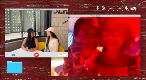


The red backdrop was a default setting as I only focused on developing the main elements. This was inspired by the picture below that was suggested by Chelsea.
Here is another variation to the layout design. I had input the title to view how the thumbnail would look as a whole. I discarded the glitch effect on the background because I thought it was a bit too much for the audience which would prevent them from clicking as it may look unappealing and unprofessional. I added a shadow which may possibly connotes something darker within which may create suspense.

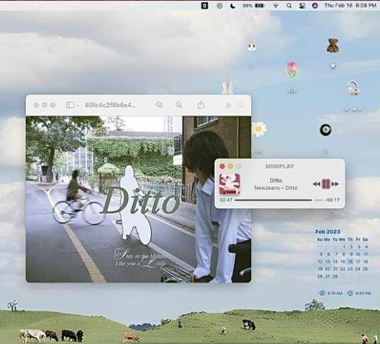
This was a creative idea to showcase the whole digital media theme that we had incorporated in our documentary. There were also several documentary thumbnails that used this element, a desktop or layout from computers/PC. However, it just does not look real overall and the platform that we used is also limited so we discarded this design as well.


Rara made this design and we were quite fond of the black and white theme but however it does not represent our documentary accurately as the colour grading here isn’t used throughout. This would not make a clear connection between the thumbnail and the documentary itself.


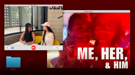
Here is another layout for the thumbnail that I had developed from the photobooth tab layout. 
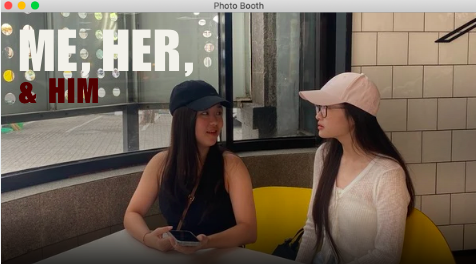


This idea was overall our favourite as everyone in our team likes how our 2 main characters were put together showcasing their bond. And we wanted to have our thumbnail to fit our main theme of our documentary (digital media/online) which is why the picture was shown in Macbook’s photobooth tab. The shadows added gave the same connotations from our experiment before.
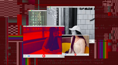


Developing from the idea before, I inserted the pictures and divided them into different tabs. This was an idea we got inspired from a documentary on Netflix. The different pieces of each cat connotes that each of the cats side have its own perspective, so with this we want our audience to know that our 2 main characters have its own perspectives that clash with one another even though they are so called ‘best friends’ we want to build an image that there's something else going on in their friendship. Hence why we believe this element fits best not only for our plot but for our overall theme as again our documentary is focusing on a digitised approach. 
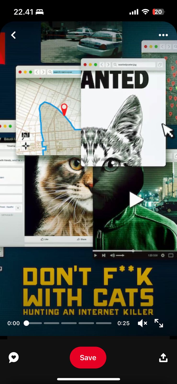

(An inspiration we took from another crime documentary thumbnail)


Here is a variation of layout derived from the photobooth tab previously. This approach was designed and written by Rara and Audrey.


Step 1

It still gave a sense of suspense with the black background (connotes: mystery, death and evil) I also changed the glitch effect to white with a different design. I added a shadow to further emphasise the title to make it stand out but it doesn’t look good.
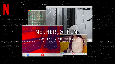


Step 2 

So initially we didn't have a subheading as you can see from the draft above we added one on the spot because again our whole plot is about a horror that was unveiled through online suspicions and evidence. 
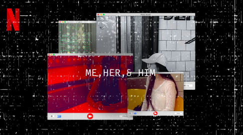


Step 3

Then I asked for feedback for this thumbnail and Chelsea and Audrey said that the word ‘him’ was not noticeable enough. I also tried to move the text lower but then it just seems more out of place. So I tried removing the subheading from the draft but it doesn't give enough context for the audience to know what's the main plot so we decided to use the subheading.
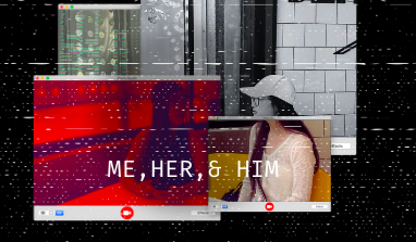


Step 4

We then included the subheading but again having the text in a the lower portion side of the thumbnail makes it look more off and not aligned with the rest of the images/elements. 
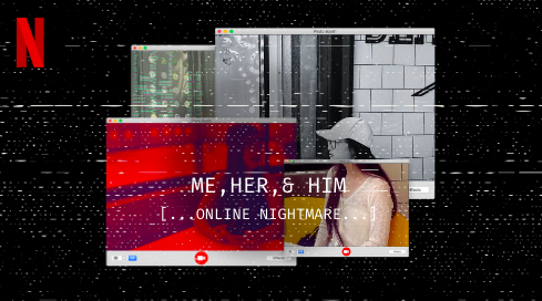


Step 5

We thought that the shadow was a bit much and that it actually makes the image look weird. Our worry was that the title could not be seen and viewed by the audience which prevented them from being interested to click on our thumbnail and engage further with our documentary. So, we tried to discard the shadow and see the results without it.
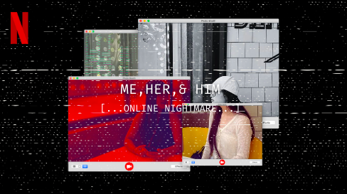


Step 6

We figured that it was still off as the audience could not read the title well from the colour. But, to conform to thumbnails of crime documentaries, it’s only acceptable and professional to use monochrome colours, or red. So, we decided to highlight the word ‘him’ to create a confusion to the audience which acts as a hermeneutic code as we don’t reveal the ‘him’ directly in the thumbnail but to falsely and purposely give a hint on the murderer/assailant. This would also keep the audience engaged and may be interested to click on the thumbnail. However, our intentions were discouraged as the red text does not make the word stand out but rather making it more difficult to read which is why we had to change it.
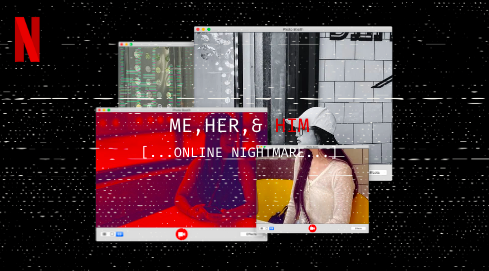


Step 7 (FINAL)

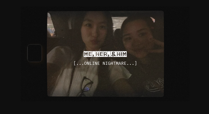
Here we only changed the size of the font in order for it to pop up more and can be easily read by the audience. We also decided to leave the word ‘him’ white because we changed the filter for the back picture so the white text can be more easily visible which solves all the problems we had regarding the thumbnail and leaves us the final design.

---------------------------------------------------------------------------------------------------------------------------------------------------------------

𝑺𝒆𝒍𝒇 𝑹𝒆𝒇𝒍𝒆𝒄𝒕𝒊𝒐𝒏:

This thumbnail research is really beneficial for me and my teammates as we further explored the conventions within the genre. We are able to identify key elements needed for a generic crime documentary in order for audiences to understand and recognise the genre of our media text (Genre Theory Stuart Hall). 
Problem (P): It was a real huge problem to manage our time as we created this research and development. Me and Rara had struggle to make the thumbnail fitting to our documentary as we aren't completely finish with the editing of the thumbnail by the time we created this development. 
Solution (S): We had forced ourself to work overnight to finish everything completely. Next time, we need to focus on our time management to allocate and complete our tasks efficiently.


Project Doc: Title Development

Here is the development for our documentary's title. This blogpost is written by Rara.


Genre: Crime Documentary 

Sub genre: Murder 

Documentary name: 

1. "Digital Deceit: Betrayal in the Click"

2. "Web of Lies: A Friend's Fatal Secret"

3. "The Perfect Match: A Deadly Friendship"

4. "Swipe Right, Murder Left"

5. "Fatal Connections: Trust Turned Deadly"

6. "Best Friend, Worst Nightmare"

7. "Online Obsession: The Dark Side of Love and Loyalty"

8. "Virtual Vows, Real Revenge"

9. "The Double Life: Love, Lies, and Murder"

10. "The Friend Trap: Murder Behind the Screen"

11. "Fallacy"

12. "Deception"

13. "Obscura"

14. "Me, Her, & Him" 


I highlighted the words that I believe will be the most catchy for our documentary and we all finally decided on "Me, Her, & Him". As we want it to still appeal to our target audience however add a twist as they wouldn't know who's the killer. CONNOTATIONS: MYSTERY, DECEPTION, CONFLICT, LOVE, DRAMA.

---------------------------------------------------------------------------------------------------------------------------------------------------------------

𝑺𝒆𝒍𝒇 𝑹𝒆𝒇𝒍𝒆𝒄𝒕𝒊𝒐𝒏:

We didn't really spent much time on creating this blog post as we already had a few set list of documentary titles in mind. Me and my teammates were actively engaged and participated in giving ideas and thoughts for the title of our documentary. We had collaborated to analyse the deep implications and connotations for each title idea in order for it to reflect the message of the documentary in order for it to be conveyed well to the target audience.
Problem (P): The one problem is that we couldn't decide on a fixed title. We wanted our documentary's name to be short and simple for the audience to remember. So we chose 'Deception', but it sounded rather like a movie than a documentary. We also didn't want our title to be long to remain catchy and memorisable. 
Solution (S): It makes it easier for us to list down our ideas to be selected as the fixed title. We are also capable of researching and finding the fitting title to convey messages and themes decoded on our media project.
Overall, I really enjoyed this progress as we dig deeper onto the implications of our crime documentary.


Wednesday, September 4, 2024

Project Doc: Editing

Here is the editing process of our documentary. Chelsea was the editor for our team as she was the only one with the access to our file. This blogpost is written by her.

To edit the crime documentary video, I used CapCut that is compatible for Macbook, this is a free editing app for PC designed for beginners (like me) and experienced creators which offers a variety of tools for both basic and advanced editing tasks to create high quality and visually appealing videos. CapCut also has an online version that is meant for novice editors and doesn't require downloads or installations; nevertheless, I got the installed version on purpose in order to edit offline and organise my files better. Below are the process of my editing sequence in this presentation file: 
EDITING by chelsea tirta


---------------------------------------------------------------------------------------------------------------------------------------------------------------

𝑺𝒆𝒍𝒇 𝑹𝒆𝒇𝒍𝒆𝒄𝒕𝒊𝒐𝒏:

The editing was done completely by Chelsea however she relied on our thoughts and ideas which we initiatively given as a group giving each other some feedbacks in order to strive for best possible grades. 
Problem (P): We aren't expertised on editing with digital platforms on computers which was a difficult situation for all of us. We are familiar with the mobile version of the application, Capcut, and found out that it has a desktop/PC version of it. We decided to download it as a group. However, the main problem is that the file can only be accessed by one person, which is Chelsea, as she created the file. This was difficult for us to collaborate as we must rely on face-to-face meetings which were really difficult to manage. We all had our separate schedule and the only time we meet, which would be in Media class, we were assigned to learn or do something else which means the editing process must be done outside school hours. There were also many features and elements of the platform which needed payment for, this decreases and limits the technical elements we can integrate to our project which may minimize the expectations from the results.
Solution (S): This forces the responsibility of editing to be given almost the entirety to Chelsea as she was the owner of the file with only her laptop as the only way accessing it. We made a last-minute plan to edit the whole documentary in Rara's house before the submission. This was a bit hectic because we were all still busy and we had minimised the time for editing as we needed further discussion. But, we all collectively decided to host an online meeting on the night and pull an all-nighter to work on our project, with our own efforts, we are able to complete it.
Action Plan: I think we should've one this method (online meetings) a bit sooner so that we wouldn't have to cram everything in a few nights. We need to have better coordination and planning in the future so that we aren't late to submit our project as a team and achieve the best results. We need to incorporate a sense of discipline for our next project (Comp 3).


Tuesday, September 3, 2024

Project Doc: Behind the Scenes

 Here is the behind the scenes throughout the production progress for my documentary project.


EMBED LINKS INTERROGATION
INTERROGATION by chelsea tirta BEACH
BEACH by chelsea tirta ONLINE
ONLINE by chelsea tirta
CRIME SCENE by raraa


---------------------------------------------------------------------------------------------------------------------------------------------------------------

𝑺𝒆𝒍𝒇 𝑹𝒆𝒇𝒍𝒆𝒄𝒕𝒊𝒐𝒏:

I have to thank Chelsea and Rara to create this Canva file that she shared with us to make it easier for us to display and show the production stage's behind-the-scenes. Here, I had helped took pictures and put/compile them in a Google Drive file we made along as sharing it to the group chat we had that allows easy collaboration. It was easy to create this behind-the-scene blog post as we incorporated the pictures and what happened during the production. I think it's better to create a weekly/daily journal to track down what we did to further elaborate and analyse our techniques and strategies during the production.

Friday, August 23, 2024

Project Doc: Filming Schedule

This is the filming schedule for our production process (shooting). Chelsea had found a website and created the schedule for us, however we all had contributed to plan out dates, locations, props, and the timeline of the shooting. This blogpost is written by me (Audrey).


---------------------------------------------------------------------------------------------------------------------------------------------------------------

𝑺𝒆𝒍𝒇 𝑹𝒆𝒇𝒍𝒆𝒄𝒕𝒊𝒐𝒏:

Before production
How would a schedule help me?
A schedule would help me by organising what I need to do and when I need to do it. It allows me to keep on track so I do not fall behind by the submission date for the project. I may be able to avoid hectic and unexpected events that prevents the continuity of the production progress as this visual aid may help me identify important dates which distinguishes shooting time and other activities. As a group, we may be able to allocate our time spent for the production in order for us to be ensured to meet deadlines and avoid the stress of last-minute works. This also helps us to track our progress together as we share this schedule. It's also ensures a smoother communication between teammates as the schedule brings out a sense of clarity to help with the efficiency of our progress and completion of our project.
Is it realistic?
It should be realistic because we have tight personal schedule that inhibits more time being spent for us to work as a group for our documentary progress. The schedule must be followed accordingly to ensure our project is finished completely before submission date. It acts as a benchmark for us to finish and tick out our to-do list for every week, specifically for the shooting. Chelsea found this website (Jotform) which provides an easy layout for us to separate filming schedule, to-do lists, and list of production requirements which makes it easy for us to understand and comprehend our needs for the completion of this project. Hence, the importance of this schedule to be followed.
What problems might I face?
I think the biggest concern would be unexpected or sudden events, such as sick/absence for school lesson or unable to come to shooting days or even weather that prevents shooting to continue, this would hold back our production progress. This is very concerning which is really why I hope that we can all prevent from this circumstance to happen. And if it does as it is completely out of our hands, we hope for the best that we can manage and deal with the possible challenges.

After production
Problems:
I was sick in one of the days where we had to shoot on the beach. The weather was also gloomy which concerns the continuity of the shooting process. This already foreseen by us which is why we had prepared another location to shoot if it rains. Luckily, it didn't rain and we added the gloomy whether to match the dark appeal in crime documentaries to conform to the conventions. My friends were also capable to conduct and keep the production going as I was absent that time. 
Another problem identified was the unavailability of the cast to attend to the allocated date and time for our shooting. 
Solution:
We had to change the dates in order for the whole cast needed can attend the shooting/production progress as this was really important. This was managed easily and calmly by me and my peers as we started to shoot our scenes earlier and prioritise to shoot our documentary project. 
Action plan:
Although we had predicted the challenges we're gonna face, it is important for us to actually avoid these circumstances. We have to be able to create this schedule earlier so that we have more time to allocate and discuss our shooting dates with the other crews and cast.

Thursday, August 22, 2024

Project Doc: Location Scout + Risk Assessment

This is the location scout and risk assessment for our production process (shooting locations). This report is created by Kalista and Rara. However, me and Chelsea helped in discussing the locations. This blogpost is written by me (Audrey).

Click here to access the link directly to the file for our location scout + risk assessment.


---------------------------------------------------------------------------------------------------------------------------------------------------------------

𝑺𝒆𝒍𝒇 𝑹𝒆𝒇𝒍𝒆𝒄𝒕𝒊𝒐𝒏:

This location scout and risk assessment is written by my teammates, Kalista and Rara. However, I helped on discussing the location choices for our filming. Overall, the risk assessment wasn't really time consuming as my peers and I was already familiar with the places that we had chose so we know the condition and situation of the locations.
Problem (P): However, the location scouting was particularly time-consuming as we needed to set a fixed setting for our documentary. This was a problem for us as we hadn't been able to complete the full planning of the chronology and plot of the documentary which made us indecisive to figure out the mise-en-scenes, especially the setting. In addition, after we decided on a location, we had to make changes on d-day due to weather or circumstances which had been discussed on the risk assessment. This was handled professionally by me and my teammates.
Solution (S): Firstly, although it took a long time to decide the locations and plannings of the documentary, we had been able to agree on a location and both Kalista and Rara had been able to complete the scouting and risk assessment smartly. Lastly, during the shooting, we had created changes on the location but it was no problem as we had already assessed a back-up plan included on the assessment above which gave us an advantage as we managed to save time to discuss more locations as we had many options for shooting locations.

Wednesday, August 21, 2024

Project Doc: Storyboard

Here is the storyboard for my documentary project. Me and Chelsea created this storyboard (I did the first half whereas Chelsea did the last half). This blogpost is written by me (Audrey).

This storyboard acts as a visual guide for the chronology of the events. I apologize if the final results does not seem perfect.

Click here to access the link directly to the file for our storyboard.


---------------------------------------------------------------------------------------------------------------------------------------------------------------

𝑺𝒆𝒍𝒇 𝑹𝒆𝒇𝒍𝒆𝒄𝒕𝒊𝒐𝒏:

I have made a storyboard for a previous project that I had last year on Media Studies and we also had a lesson discussing what elements are included in a storyboard. This knowledge had benefited me as I knew what I had to do (draw) and include in the storyboard which saves me time from researching storyboards from scratch. 
Problem (P): The problem that I faced personally when doing my part for the storyboard was managing my time. We had other aspects of the project to focus on (script and plot) which prevents my focus and efforts to be sorted to the making of our storyboard. I had other things to finish (such as the research on crime documentaries and its conventions) as I also did not have enough time to finish them before moving on to the next part of my blog/next step of the project process. Other school works outside Media Studies were also on the way which inhibits me to focus completely on the documentary project.
Solution (S): We (me and Chelsea) were able to divide this task into two; I drew the first-half while Chelsea drew the other/last-half. This makes the job easier for us as we shared the responsibilities. At the end, I was able to finish my part of the storyboard even if it does not look professional. Either way, the use of storyboard is to guide us visually regarding to the chronology of the events on the documentary. This was enabled completely as our storyboard consist of all the elements and information needed for our production progress.
This storyboard acts as a visual guide for the chronology of the events. I apologize if the final results does not seem perfect (the document scan did not capture the drawings perfectly and could not be seen properly).